ap - 16
ap - 17
- service
- type design
- year
- 2026
- for
- Andromedas Positionen
- glyphs
- 26 + 26, unicase
- body
- 1000 upm / 700 u
- formats
- OTF, WOFF2
AP-16 and AP-17 are two display typefaces drawn for Andromedas Positionen — a pair built on one system of proportions and pulled in opposite directions.
AP-16 is brutal and condensed: straight cuts, faceted joints and spurs turn every letter into a narrow armoured sign. AP-17 is its opposite — an extended hairline in the spirit of 2000s futurism, where a single letter can run four and a half ems wide.
Both faces share a unicase alphabet, the same 700-unit body and a common baseline, so they can stack, overlap and replace each other across posters, merch and the event’s digital surfaces.
fig. 06 — one body, two directionsAP-16 / signal — 2155 uAP-17 / signal — 13818 u×6,41
fig. 07 — specimen posterA2, 420 × 594 mmsignal / medium / AP16
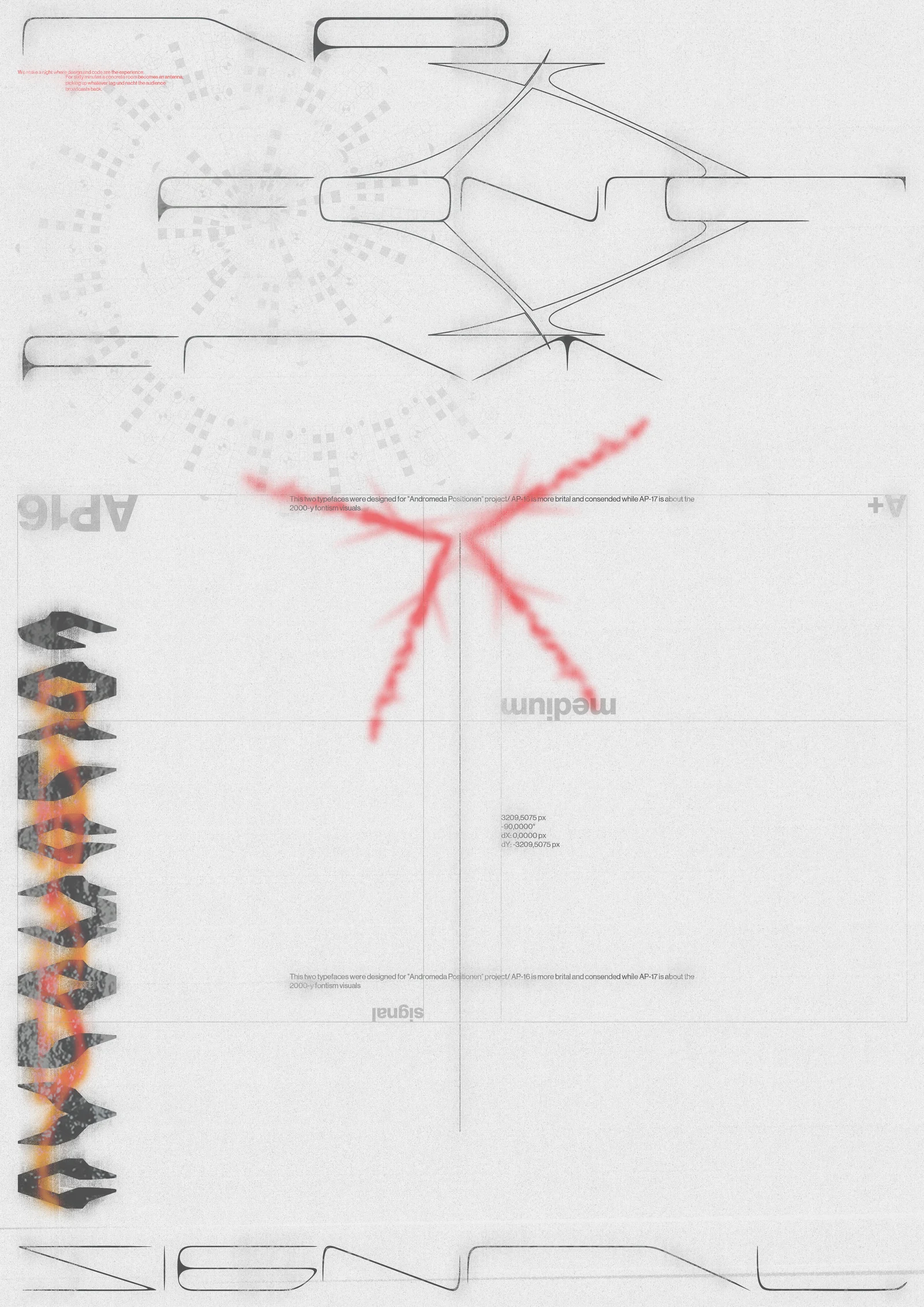
fig. 08 — AP-16 Regular, a–zhover — nodes
- aU+0061 · 459
- bU+0062 · 354
- cU+0063 · 370
- dU+0064 · 350
- eU+0065 · 248
- fU+0066 · 370
- gU+0067 · 350
- hU+0068 · 459
- iU+0069 · 244
- jU+006A · 352
- kU+006B · 363
- lU+006C · 438
- mU+006D · 627
- nU+006E · 370
- oU+006F · 459
- pU+0070 · 436
- qU+0071 · 459
- rU+0072 · 459
- sU+0073 · 314
- tU+0074 · 448
- uU+0075 · 459
- vU+0076 · 577
- wU+0077 · 689
- xU+0078 · 388
- yU+0079 · 476
- zU+007A · 467
fig. 09 — AP-17 Regular, a–z96,12 px / 1000 u
- aU+0061 · 4520
- bU+0062 · 2551
- cU+0063 · 3822
- dU+0064 · 2481
- eU+0065 · 2472
- fU+0066 · 2504
- gU+0067 · 2251
- hU+0068 · 2915
- iU+0069 · 258
- jU+006A · 2386
- kU+006B · 2633
- lU+006C · 2390
- mU+006D · 3026
- nU+006E · 2249
- oU+006F · 2196
- pU+0070 · 3176
- qU+0071 · 2359
- rU+0072 · 2561
- sU+0073 · 2150
- tU+0074 · 4751
- uU+0075 · 2534
- vU+0076 · 3489
- wU+0077 · 4109
- xU+0078 · 2703
- yU+0079 · 4318
- zU+007A · 2645